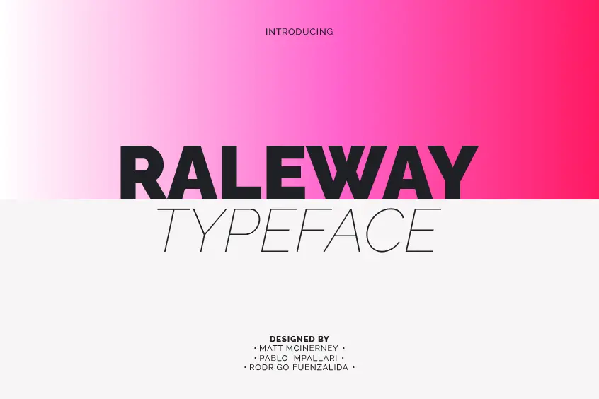
Introducing Raleway Font
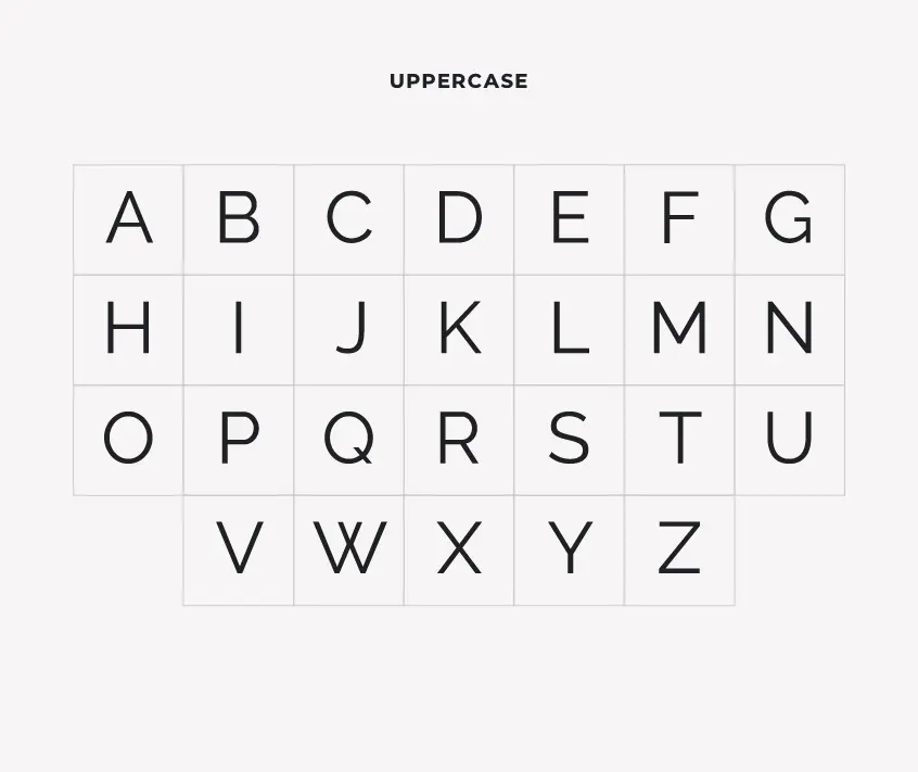
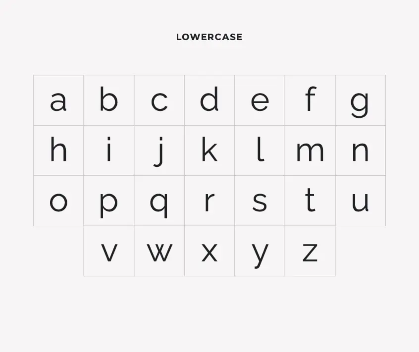
Raleway Font is a sans-serif, neo-grotesque typeface that has been specifically designed for titles, particularly for use at a higher scale. It has a sleek and functional appearance that makes it ideal for use in a wide range of applications, from logo design to web design and even print projects.
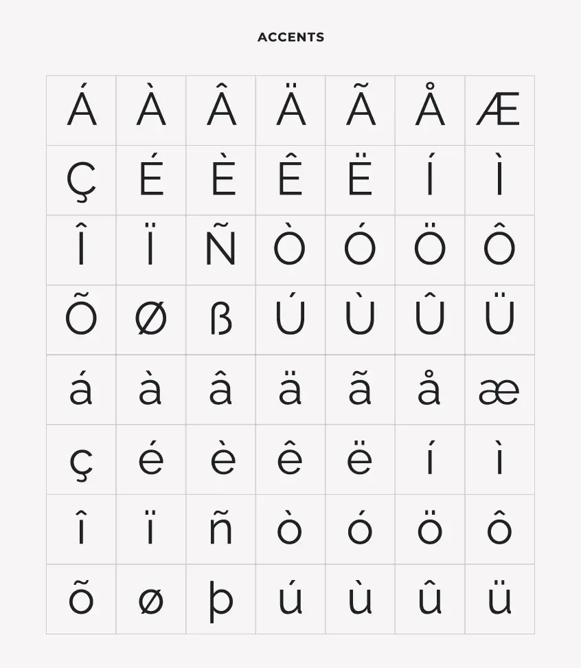
The font also features an extensive character set, allowing it to be used in a variety of languages. In this article, we will take a closer look at Raleway Font, including its history, features, classification, and more.
The History of Raleway Font
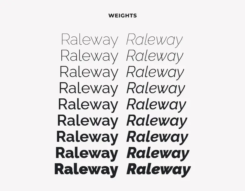
Raleway Font was established in 2010 as a slim single-weight font, created by Matt McInerney. Initially, the purpose of the font was for use on the web, thanks to the noticeable trend that was in the years 2010-2012 due to the digital revolution and the constant use of smartphones. Later on, the font family was expanded to include nine weights and their corresponding italics by Pablo Impalari and Rodrigo Fuenzaleda.
Features of Raleway Font
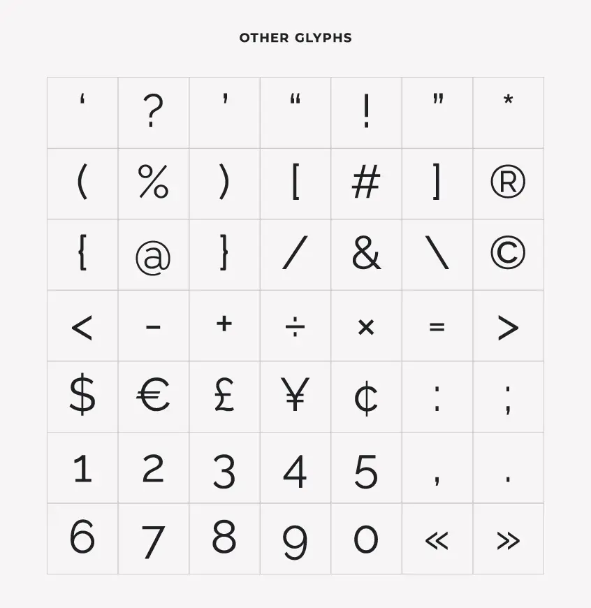
Raleway Font has several features that make it a popular choice among designers. It includes the antique type and lining numerals, standard and discretionary ligatures, a comprehensive set of diacritics, and stylistic alternatives inspired by more geometric sans-serif typefaces than the default neo-grotesque-inspired character set. It also has a sister family named “Raleway Dots.”
Raleway Font’s Classification
In terms of typographic classification, Raleway Font is a neo-grotesque font. Neo-Grotesques are a sans-serif style that originated in the nineteenth century. They exist in abundance on computers because they are widely used for digital media. Other examples of this type are Helvetica and Microsoft Arial styles that occupy together with Raleway this subcategory of Sans-serif, where the fonts are relatively straight with little variation in line width.
Using Raleway Font
Raleway is a versatile font family that can be used for various personal and commercial purposes without incurring any cost. Developed by The League of Moveable Type, the world’s first open-source type foundry, Raleway was introduced in 2009 with a vision to raise the standards of web design.
This font is a preferred choice for titles, subtitles, and running text that contain a small number of characters. Its elegant design and subtle curves make it an excellent typeface for headlines and small paragraphs, which can be enhanced by pairing it with other typefaces for an impressive visual impact.
One of the key features of Raleway is its extensive range of symbols and punctuation elements, making it useful for a wide range of applications, including inexact sciences like mathematics, physics, and chemistry. These symbols provide designers with the freedom to apply this font to various media and not just limited to artistic mediums.
Additionally, Raleway’s original web design allows for easy application and customization, making it a popular choice among designers. Its usage is not restricted to web design, but it can also be used in print materials, including flyers, brochures, business cards, and other promotional materials.
Raleway Font Pairing
Typography plays a crucial role in design aesthetics and effectively communicates a message to the audience. One font may not always be sufficient to create a cohesive and visually appealing design. It is therefore imperative to explore different font pairing options, which can bring harmony, balance, and a unique personality to your typography design.
Raleway, a refined sans-serif typeface, is one such font that can elevate the overall design aesthetics of a project. Its clean and elegant lines make it a versatile option that pairs exceptionally well with serif and sans-serif fonts. Some of the top serif fonts that complement Raleway and provide a distinct contrast that adds an air of sophistication to your design are:
On the other hand, Raleway can also be combined with other sans-serifs such as:
These pairings offer a modern, sleek, and clean look that enhances the readability and makes the design more contemporary.
However, it’s important to note that the perfect font pairing depends on the specific design, target audience, and intended message. Each font pairing combination creates a unique look and feel, which can evoke different emotions and responses from the viewer. Therefore, taking the time to experiment with different font pairings and selecting the perfect combination can make a huge difference in the overall impact of your design.
License for Raleway Font
The striking Raleway Font, renowned for its elegant and modern design, is a typeface that is licensed under the esteemed SIL Open Font License, Version 1.1. This widely recognized license is readily available for perusal, accompanied by an informative FAQ, at http://scripts.sil.org/OFL. The provisions of this license allow for liberal utilization, modification, and distribution of the font, making it an increasingly preferred option for both personal and commercial purposes.
Hence, if you are seeking a font that offers versatility, style, and simplicity, then Raleway is an excellent choice that you shouldn’t hesitate to embrace. Waste no time, download Raleway font today and experience its exquisite features in your projects.