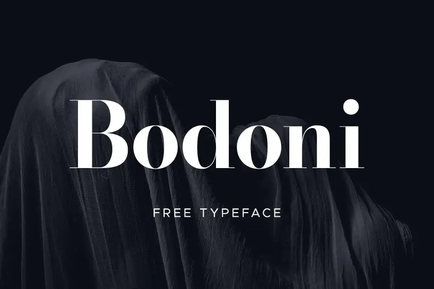
Introducing Bodoni Font
Welcome to the world of Bodoni Font, where elegance meets timelessness. Allow me to captivate you with the enchanting tale of this exquisite serif typeface, originally designed by the legendary Giambattista Bodoni in the late 18th century. Prepare to be mesmerized by its high contrast between thick and thin strokes, its commanding vertical stress, and its distinct flat serifs. Bodoni Font is a true classic, embodying sophistication and grace, and it has been adorning headlines, logos, and posters for centuries.
The Variations of Bodoni
Step into a realm where Bodoni’s legacy has been revived and reimagined by talented designers and foundries. Through their artistry, a myriad of Bodoni variations have emerged, each with its own unique details and nuances. Among these remarkable versions, we proudly present Bodoni*, a font that will leave you in awe.
It’s essential to acknowledge that despite the immense popularity of Bodoni typefaces, no digital family has been able to capture its essence without compromises—until now. Indestructible Type has painstakingly developed Bodoni*, the first-ever no-compromises Bodoni font family, specifically crafted for the digital age. Years of dedication and expertise have culminated in this masterpiece, boasting an astounding collection of 64 static font files and 2 variable font files. With Bodoni*, you’ll have the perfect Bodoni font for every conceivable situation.
The Origins of Bodoni
Let me transport you back to the captivating world of 18th-century Italy, where Giambattista Bodoni, a visionary typographer, was born in the town of Saluzzo. As a young man, he honed his craft under the guidance of his father, a printer at the esteemed Royal Printing House. However, it was in Rome, at the Propaganda Fide press, where Bodoni’s passion for typography truly ignited. Surrounded by the works of illustrious type designers like John Baskerville, Pierre Simon Fournier, and Firmin Didot, Bodoni found inspiration to create his own unique style.
In 1768, destiny beckoned Bodoni to the Royal Printing House in Parma, where he assumed the role of director at the invitation of the Duke of Parma, Ferdinando di Borbone. This newfound position granted him unparalleled artistic freedom, enabling him to explore his boundless creativity. With an extensive collection of typefaces at his disposal, Bodoni embarked on a remarkable journey, acquiring cutting-edge printing equipment and materials that allowed him to produce exquisitely fine and consistent impressions.
Bodoni’s tireless efforts bore fruit as he began to craft his own typefaces. While influenced by his predecessors, he infused his designs with his distinct taste and style. The fonts he created were elegant, harmonious, and expressive, captivating the hearts of printers, publishers, and patrons across Europe. Bodoni’s masterpieces graced the pages of numerous prestigious books, including editions of works by literary giants such as Homer, Virgil, Horace, Dante, and Voltaire. Notably, he even had the honor of printing official documents for Napoleon Bonaparte and the Vatican. His unparalleled contributions earned him esteemed titles like Royal Printer from the King of Spain and membership in the Institute of France.
Bodoni left behind a remarkable legacy when he departed this world in 1813. His remarkable collection encompassed over 300 typefaces and an extensive assortment of matrices, punches, specimens, and books. To immortalize his work, his widow, Margherita Dall’Aglio, published his Manuale Tipografico in 1818—an invaluable treasure trove containing 142 sets of Roman and italic typefaces, as well as scripts from various languages.
The Font Clasification
The Bodoni Font is classified among the so-called neoclassical, modern Roman, or Didone. It is characterized by extreme contrast between the thick lines and some of the characters and by a strong vertical modulation, which makes it necessary to use them with a wide line spacing.
The Bodoni typeface took full advantage of this design approach, with generous use of white space that made it stand out magnificently. The shining and contrasting qualities of the guy. During the 20th century, numerous updates of this type have been made, with the intention of preserving these qualities and making them more efficient in terms of their demand for space.
Modern types are imposing too large bodies, but they show a certain lack of legibility when breaking the eyes of the character, optically or truly, when composing small bodies and in blocks of running text. Notable examples could be Firmin Didot, Bodoni, and Fenice.
Features of Bodoni Font
- High Contrast
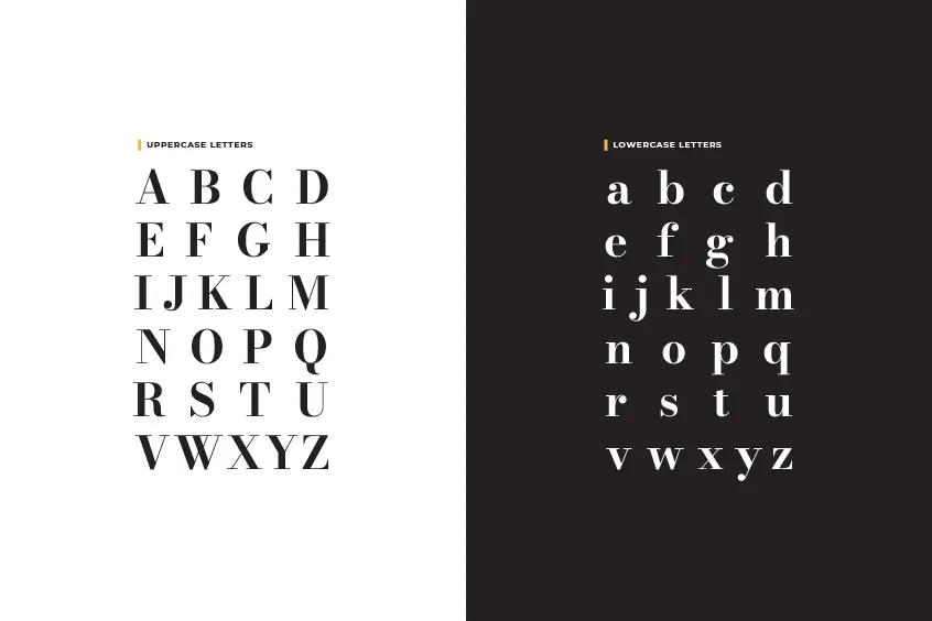
Bodoni font is truly a masterpiece of design, and its high contrast is one of its most captivating features. The stark difference between the thick and thin strokes creates a visual impact that demands attention. The thin strokes are delicately crafted, almost ethereal, while the bold thick strokes exude strength and solidity. This stark contrast not only adds visual interest to the letters but also enhances the verticality, making each character stand tall and proud. When you choose Bodoni font, you embrace a style that is visually striking and unforgettable.
- Vertical Stress
Bodoni font embodies a unique design element known as vertical stress. Unlike traditional fonts with diagonal stress, Bodoni font aligns the thickest part of its curved strokes vertically. This intentional vertical alignment imparts a sense of symmetry and balance to each letter. It creates an impression of upright elegance that sets Bodoni font apart from its predecessors. By choosing Bodoni font, you embrace a typographic style that exudes a timeless and refined aesthetic, with each character standing tall and graceful on the page.
- Unbracketed Serifs
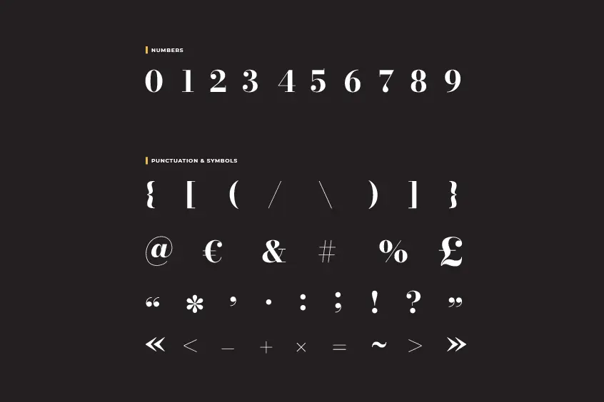
The unbracketed serifs of Bodoni font are a testament to the font’s exquisite craftsmanship. These thin extensions at the end of each stroke add a touch of finesse and sophistication to the overall design. The serifs are flat and horizontal on the top and bottom, perfectly perpendicular on the sides, without any curves or transitions. This clean and minimalist approach enhances the clarity and readability of the font. With Bodoni font, you are choosing a typeface that embodies simplicity and elegance, where each letter is meticulously crafted to perfection.
- Geometric Proportions
Bodoni font’s geometric proportions are a testament to the meticulous attention to detail that went into its creation. The letters adhere to precise mathematical ratios and optical adjustments, resulting in a harmonious and balanced visual experience. The uniform widths and heights of the letters create a sense of order and structure, while the curves exhibit circular or elliptical forms. The sharp angles add a touch of modernity and boldness to the font. When you select Bodoni font, you embrace a typographic style that seamlessly blends mathematical precision with artistic elegance.
- No Compromises
Bodoni font represents a labor of love and dedication, with no compromises made in its creation. Every aspect of this font has been meticulously designed to honor the legacy of Giambattista Bodoni and his typographic principles. The font was built from scratch, following the guidelines laid out in the Manuale Tipografico, to ensure the ultimate digital realization of Bodoni’s vision. The creator of Bodoni* poured endless hours into perfecting every detail, leaving no stone unturned in the pursuit of typographic excellence. By choosing Bodoni*, you embrace a font that stands as a testament to the unwavering commitment and uncompromising quality.
- Full Range of Weights & Matching Italics
Bodoni font pushes the boundaries of typographic design by offering a full range of weights, including the awe-inspiring Fatface style. Fatface, with its extreme boldness, creates a dramatic and impactful visual effect that captures attention. Unlike many other fonts, Bodoni* provides matching text weights alongside its Fatface variant, ensuring a cohesive and versatile typographic system. The inclusion of corresponding italics further expands the font’s expressive capabilities, allowing you to convey emphasis and style effortlessly. With Bodoni font, you gain access to a comprehensive typographic toolkit that caters to all your creative needs.
- Extended Character Set
Bodoni* not only excels in its aesthetic design but also shines in terms of functionality. Each style of Bodoni* offers an extensive character set, accommodating hundreds of characters and supporting over 50 languages. This inclusivity ensures that regardless of your linguistic requirements, Bodoni* has you covered. Moreover, Bodoni* goes beyond the ordinary by including fractions and unusual punctuation, such as the interro-bang, expanding the font’s versatility and enabling you to create captivating and unique typographic compositions. With Bodoni font, you gain access to a world of possibilities without sacrificing elegance or quality.
- OpenType Features
Bodoni* embraces the digital age and harnesses the power of OpenType features to enhance its functionality. With stylistic alternatives and a comprehensive set of ligatures, Bodoni* adapts seamlessly to different design contexts. These features ensure that the font adjusts subtly and effortlessly to complement various layouts and applications. Bodoni* empowers you to achieve visual cohesion and excellence in any typographic project, allowing your creativity to flourish. When you choose Bodoni*, you embrace a font that seamlessly blends traditional elegance with modern functionality.
- One Size Does Not Fit All
Bodoni font takes into account the importance of optical sizing and provides a solution that exceeds expectations. Giambattista Bodoni understood that different letterforms were needed for various sizes, and this principle is meticulously applied in Bodoni*. With eight distinct optical sizes, 06, 11, 16, 24, 36, 48, 72, and 96, each size is carefully tailored to ensure optimal legibility and aesthetics. The razor-thin strokes that define Bodoni font remain razor-thin, irrespective of the size, maintaining the font’s distinctiveness and visual impact. By selecting Bodoni font, you embrace a typeface that adapts flawlessly to any scale, offering a consistent and captivating reading experience.
- Convenient Web Hosting
In today’s digital landscape, web fonts play a crucial role in creating captivating online experiences. Bodoni* recognizes this need and offers free and convenient webfont hosting through indestructible type*. With a simple copy-and-paste of a code snippet into your website’s <head> tag and a straightforward CSS declaration, you can effortlessly integrate Bodoni* into your web design. The hosted font files ensure a seamless and optimized user experience, no matter the device or platform. Additionally, as Bodoni* continues to evolve and receive updates, your website automatically reflects these changes, eliminating any extra work on your part. With Bodoni*, you embrace a font that not only provides impeccable design but also ensures ease of implementation and ongoing compatibility.
<link rel="stylesheet" href="https://indestructibletype.com/fonts/Bodoni/Bodoni.css" type="text/css" charset="utf-8"/>The Uses of Bodoni Font
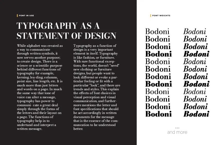
Bodoni’s timeless fonts have found their place in a multitude of purposes and contexts throughout history. One of their most prominent applications is in the world of books. Originally designed for printing books of the highest quality and prestige, especially classical and literary works, Bodoni’s fonts effortlessly convey a sense of elegance, sophistication, and authority. When you hold a book typeset in Bodoni, you instantly recognize the meticulous craftsmanship and attention to detail that has gone into its creation.
Moving beyond the realm of books, Bodoni’s fonts have also become a staple in the realm of magazines. Refined and cultured publications targeting audiences with a discerning tastes, such as fashion, art, and design magazines, have found Bodoni to be the perfect choice. The crispness of the type creates a captivating contrast against the glossy pages, resulting in a visual experience that exudes style, glamour, and luxury. Leafing through the pages of a magazine adorned with Bodoni’s fonts is like entering a world of sophistication and creative expression.
Logos are another area where Bodoni’s fonts have left an indelible mark. When a brand seeks to communicate professionalism, excellence, and tradition, Bodoni comes to the forefront. By using Bodoni’s fonts in their logos, companies can establish a memorable and distinctive identity that sets them apart from the competition. The typeface’s timeless appeal suggests a rich heritage, evoking a sense of craftsmanship and expertise that instantly instills trust in the brand. Whether it’s a luxury fashion house, a renowned perfume brand, or a classic designer label, Bodoni has proven itself as a symbol of enduring quality and refined taste.
Additionally, Bodoni has found its place in the world of posters, where it aims to captivate attention and make a bold statement. When a message needs to be conveyed with impact and flair, Bodoni’s fonts rise to the occasion. Their bold and dramatic presence commands attention, expressing confidence, power, and innovation. Whether it’s a promotional poster for a thrilling movie or a groundbreaking video game, Bodoni’s fonts lend an air of excitement and intrigue to the visuals, leaving a lasting impression on anyone who encounters them.
Some of where the Bodoni was Used
Throughout history, Bodoni has graced numerous significant publications, leaving an indelible mark on the design world. Take, for example, the iconic work “Dante La Vita Noouva” from 1925, where Bodoni’s fonts were skillfully employed, showcasing the typeface’s design ability and its seamless integration into artistic expressions.
Another remarkable application is the renowned “Poster Bodoni” by Chauncey H. GriffinTM, a design that has gained widespread recognition through its use in neon signs. You may have even spotted it in the vibrant and eye-catching posters for the movie “Mamma Mia!” or the film “Black Dahlia.”
Bodoni also played a pivotal role in the 1950 Museum of Modern Art publication, “What is Modern Design?” which was masterfully crafted by Jack Dunbar, a world leader in modern design, who drew inspiration from Bodoni’s timeless elegance for the title.
The influence of Bodoni extends beyond print media and permeates the world of advertising. Countless logos bear the mark of Bodoni’s classic style, becoming synonymous with excellence and timelessness. Renowned brands such as Guerlain, Elizabeth Arden, Giorgio Armani, and the iconic “CK” for Calvin Klein have all embraced Bodoni’s fonts to reinforce their brand identities with a touch of sophistication.
Moreover, iconic magazine publications like Harper’s Bazaar and the classic architecture magazine Metropolis have made Bodoni their staple text typeface, infusing their pages with a sense of elegance and refinement. Even Elle magazine has harnessed the power of Bodoni, employing it for its logo and titles, reflecting the font’s versatility and wide-ranging appeal.
Open Source License, and Constantly Improving
One of the remarkable aspects of Bodoni* is its status as an open-source typeface. The development of Bodoni* is a collaborative effort, where changes and improvements can originate from the community of users themselves. By supporting this project now, you actively contribute to shaping the future of this magnificent typeface. As the creator, I am brimming with exciting ideas for future features and fixes for Bodoni*, but your support is what will help turn these visions into reality.
Your input and engagement are invaluable, and if you have any ideas for how Bodoni* can be further enhanced, I encourage you to reach out and share your thoughts through bug reports. Together, we can foster the continuous growth and refinement of Bodoni*, ensuring its legacy lives on for generations to come. Join us on this journey of creativity and collaboration, and let’s shape the future of typography together.
If you have ideas for how Bodoni* can be made better, reach out with a bug report: GitHub Link
Bodoni Font Pairing
There are several free font pairings that work well with Bodoni. Some suggestions include:
All of these fonts are available for free on Google Fonts, making it easy to experiment with different pairings and find the perfect combination for your project.
The Conclusion
Bodoni Font stands tall as an unrivaled testament to beauty, craftsmanship, and artistic vision. Its rich history, stunning design, and versatility make it a cherished treasure among designers, typographers, and artists. Whether you seek to evoke a sense of luxury, elegance, or refinement, Bodoni Font is your faithful companion, ready to elevate your designs and leave a lasting impression. Embrace the timeless allure of Bodoni, and embark on a journey where tradition meets innovation, and beauty knows no bounds.