
About Axis Font
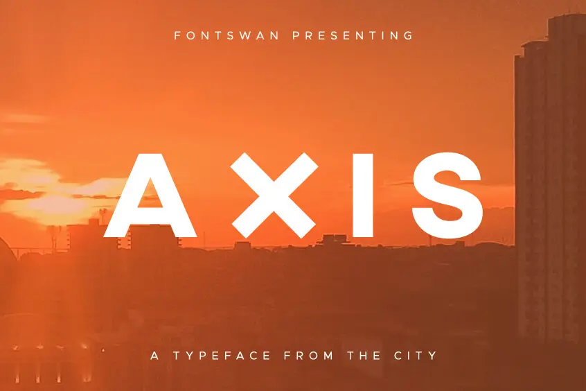
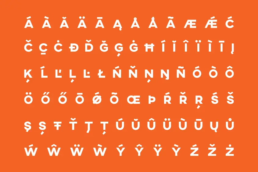
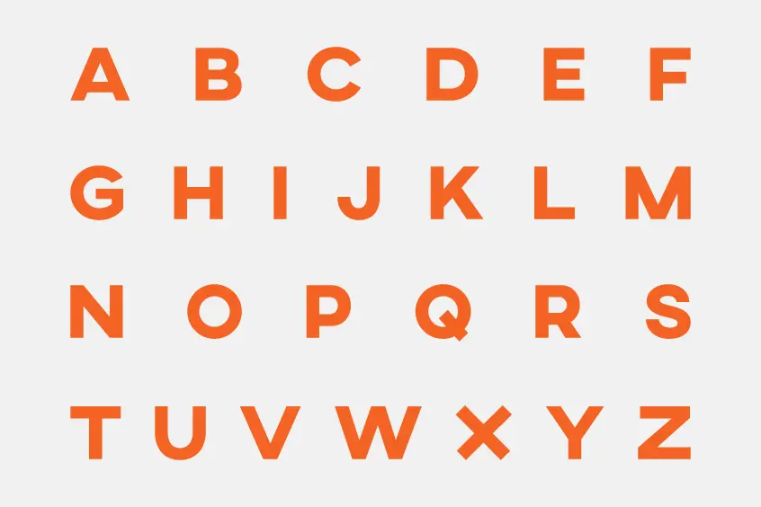
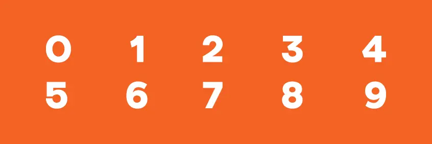
We introduce you to the AXIS Font. A geometric sans-serif font inspired by the architecture of the urban spaces. The font provides only uppercase letters, including all the required characters, and is available in one weight. In addition to the alphabet, of course, there are many international variations such as digits, punctuation, and a countless number of special characters. Healthy, full, and juicy, this is everything you want for a display font. It looks great in large and medium sizes. It can be used free of charge for personal and commercial purposes.
Jean Wojciechowski from Curitiba in southern Brazil is the designer of the Axis Font. Based on the visual trend from the mid to early 20th century to achieve neutrality. Although there are a lot of fonts that focus on similar principles, AXIS font tries to find space in the realm of anonymous fonts by combining simplicity and subtle friendliness.
Despite its simplicity, clarity, and solid shapes, we recommend Axis as a display font for posters, editorial design, and merchandising. It’s also great for digital designs, urban branding, or tech products. AXIS appears to be a typeface with a simple typographical structure and a wide range of possible applications. Hiding between straight lines and corporate confidence is a hint of charm and outrageous personality; Integral gives your words a powerful sound while being a lot of fun to use.
If you consciously pay attention to similarities or contrasts, the font combination will succeed. Even here. The geometry is vast and needs something subtle and soft. Pairing with Antiqua’s classic curved italics makes the font even more versatile. We love this, which is why we mix Axis with classic fonts (like Caslon and Garamond) or free fonts (like Vollkorn and Merriweather). Airy handwritten fonts with a thin line width can also be easily combined with Axis.