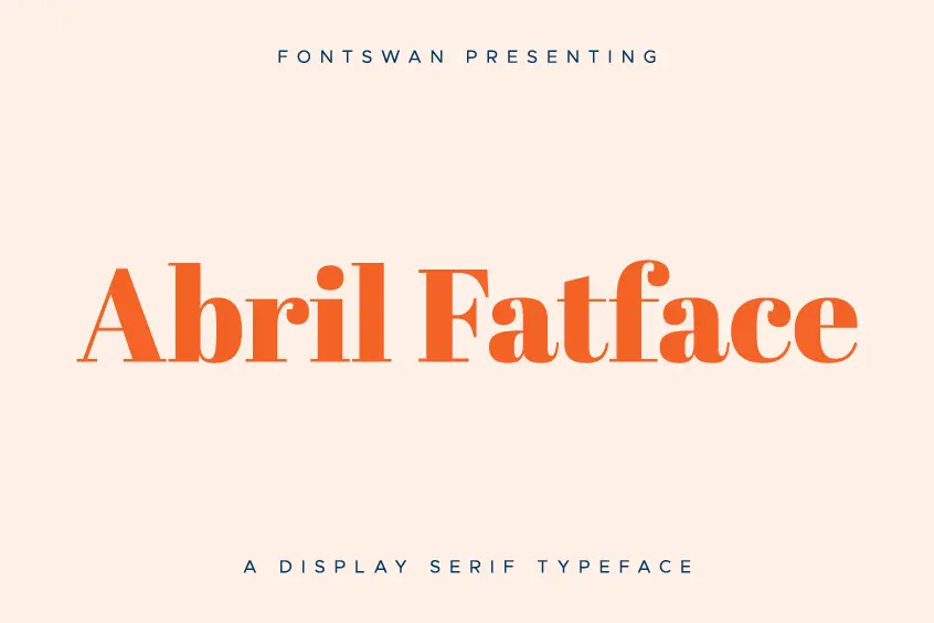

Introducing Abril Fatface Font
Abril Fatface font is a free display serif typeface designed by TypeTogether, a type foundry based in Prague, Czech Republic. This article will provide an in-depth look at Abril Fatface, its design, style, and uses.
Design and Style
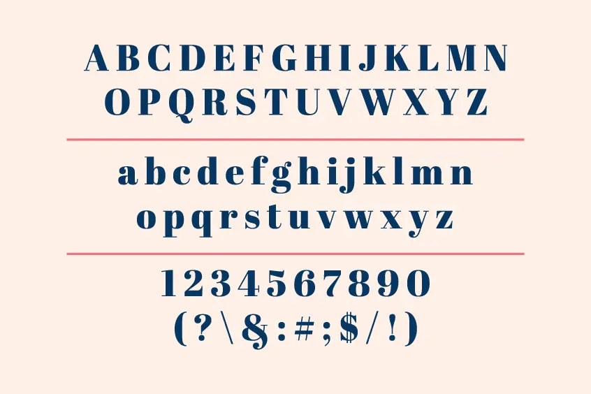
Abril Fatface is part of a large type family that includes 18 styles for all display and text uses. The font’s titling styles are based on a contemporary revamp of classic Didon models, giving them a strong presence on the page without overwhelming the reader with unfamiliar or overly captivating shapes. The font’s display style, Abril Display, grabs the reader’s attention with its curves, good color, and high contrast. It also features typographic extensions like motifs, borders, special dingbats, alternates, and numbers that provide a wide range of options for designers.
To keep display styles consistent, Abril Text styles give the initial impression of having the same shapes but with less contrast. Abril Text fonts were inspired by nineteenth-century slab serif and Roman Scottish typefaces, rather than the Didone style lineage used for Abril Display fonts. This tradition makes the text darker and less contrasting than the display, which is perfect for every need. These details help make it easier to move from one font family to another and distinguish them from one another.
Abril Fatface Font Uses
Abril Fatface has dual use in both print and digital environments. It was designed for extensive editorial use in newspapers, pocketbooks, annual reports, and magazines. Display styles have a strong presence and sense of modernity on the page, while Text Styles have been designed from the ground up to achieve adequate color, texture, and overall width for continuous and comfortable reading in both print and digital environments. Abril Fatface is a modern calligraphic typeface inspired by the mid-20th century sign painting tradition.
Abril Fatface Font Pairings
When considering font pairing, selecting the right typeface can make a significant impact on the overall aesthetic of a design. In the realm of modern calligraphic typefaces, Abril Fatface Font stands out as a superb option. With its bold and elegant strokes, it exudes a sense of sophistication and style that complements a wide range of design styles and projects.
In addition to selecting Abril Fatface as a primary typeface, pairing it with complementary secondary fonts can enhance the overall visual impact of the design. Several popular font pairings include Open Sans and Josefin Slab, Source Sans Pro and Merriweather, Inter and Raleway, and Montserrat and Lora.
Open Sans and Josefin Slab are a classic pairing with Abril Fatface that offers a sleek and professional look, perfect for contemporary and minimalistic designs. Source Sans Pro and Merriweather, on the other hand, provide a harmonious balance between elegance and legibility, making it a great choice for print materials such as magazines or books. Inter and Raleway, with their clean and modern lines, lend themselves well to web design projects, while Montserrat and Lora bring a sense of traditional sophistication to designs such as invitations and branding materials.
Ultimately, selecting the right font pairing is a crucial aspect of design, and choosing a primary typeface such as Abril Fatface and pairing it with complementary secondary fonts can create a cohesive and visually appealing design that captures the attention of the audience.
Abril Fatface Font License
The Abril Fatface font is licensed under the SIL Open Font License, Version 1.1. This license allows you to use the font for personal or commercial purposes, modify it, and redistribute it as long as you credit the original author. Additionally, you can make derivative works from the font as long as you also share them under the same license.
Conclusion
Abril Fatface is a contemporary typeface that is both visually appealing and versatile. Its large type family, consisting of 18 styles for all display and text uses, provides designers with a wide range of options for their design needs. The font’s use in both print and digital environments makes it a popular choice for editorial use in newspapers, pocketbooks, annual reports, and magazines. The font’s design, style, and license make it a great option for designers looking for a modern and unique font.